Design System Creation
Design System Creation
from €154,70
A living library of components, tokens, and guidelines that keeps your product consistent as it grows. Buttons, forms, cards, modals, everything documented.
A living library of components, tokens, and guidelines that keeps your product consistent as it grows. Buttons, forms, cards, modals, everything documented.
A design system is how you keep a product looking and behaving consistently as it grows. More screens, more features, more designers, more developers. Without a system, things drift apart. With one, everything stays coherent.
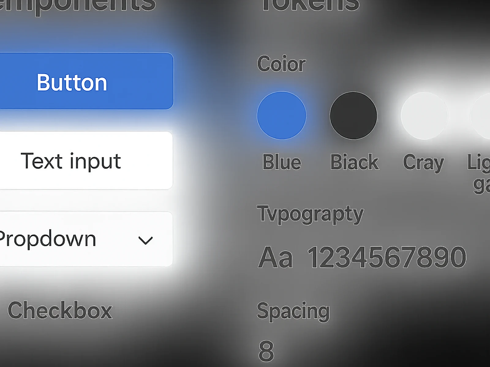
Design tokens (colours, typography, spacing, shadows). Component library in Figma with variants and states. Documentation for each component (when to use, when not to use). Responsive grid definitions. Accessibility requirements per component. Naming conventions aligned with development.
Online · Aranjuez